

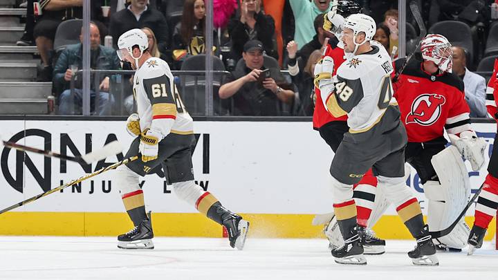
Ladies and gentlemen, I have exciting news. The Vegas Golden Knights have dropped their Hometown Remix jerseys for the 2026-27 season. Behold, the new kits in all their glory, inspired by the glorious past of Las Vegas!
First look at VGKs new Hometown Remix jerseys. pic.twitter.com/rGdNaY5dMR
— SinBin.vegas (@SinBinVegas) November 2, 2026
For the record, the green is inspired by the casino felt on numerous tables inside Las Vegas casinos. You also have the roulette tables on the sleeves, making this even more Vegas-inspired. In short, the jerseys scream "LAS VEGAS," which is always good for the Golden Knights' faithful.
Personally, I like that a lot. Las Vegas has a deep history in American culture that signifies the glitz and glamour of American life. Think of showgirls, casinos, gambling, a good time, and quality hockey. Certainly, you're not getting those things in any part of the country, are you?
But my opinion isn't enough, dear reader. We must go to the people (cue The Rock jumping in and giving a Rock Bottom to an Oilers fan) for the opinions and vibe. Do the people like the jerseys and the color scheme? Or are they throwing up in their waste baskets and acting completely grossed out?
Let's tap into the general vibes for a second and see what's happening within the Realm. The Golden Knights' fanbase has plenty to say about what's happening with the new jerseys that dropped. I will gladly give you a hint on the public's opinion, though. You'll be surprised at how many people were impressed by the overall design.
What Vegas Golden Knights fans are saying about the Hometown Remix jerseys
So, what was the overall consensus on the Hometown Remix jerseys? Were they yet another corny jersey that fans should pass up (think of the Winter Classic jerseys)? Or was this an absolute success?
Believe it or not, the fan reaction to the new Hometown Remix jerseys were overwhelmingly positive. Golden Knights fans were quick to call out any haters that had anything bad to say about Vegas's new jerseys.
Vegas’s jersey with the full uniform looks pretty dope.
— 2023 STANLEY CUP CHAMPS (@Thuzhan29) November 2, 2026
Fans from across the globe marveled at how well put the jerseys were. A bulk of Golden Knights fans were happy with the color schemes and the roulette-wheel design, making it an overall success for Vegas.
For anyone interested in the details on the @GoldenKnights HTR: Beautiful embossing on the sleeves with the Vegas-sign star, letters match the player pants, roulette motif on the inside trim. My pics are coming out blue, but it’s definitely more of a green-teal poker table color. pic.twitter.com/pRzfgbRsmA
— Z ⚔️ (@mzvgk) November 2, 2026
Of course, the older crowds aren't too fond of the new jerseys. Some Golden Knights fans chalked it up to fifth graders designing the jerseys on Microsoft Paint (which is actually a funny comparison to even think about).
They should fire the entire 5th grade class that designed these with a Windows 98 program.
— Robbie Vegas (@Rob1563GK) November 2, 2026
Still, the vibe is that these jerseys were cool. Sure, some people were put off by the green/teal look. But the color is inspired by casino felt on the tables, making it appropriate for the Golden Knights. Ironically, not enough people saw it that way, which makes it... disappointing.
sheesh the whole kit together is amazing
— Dozer Cat (@dozercat31) November 2, 2026
Oh well, you can't please everyone. As you can see from the reaction above, the entire kit is blowing fans away like never before. And no, I'm not writing that myself. Take it from the thousands of Golden Knights fans on X who appreciate a deeper dive into Las Vegas's history and lore.
 Add us as a preferred source on Google