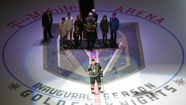
The Vegas Golden Knights seem to make it a tradition of releasing new center ice logos annually. This time, it's an all-gold affair as the team plays into its namesake. For the reveal, click here.
You can't deny that the new logo represents the franchise well. An all-gold affair plays into the gold you could win at the casino. It also represents the "gold" that the Golden Knights won in 2023, defeating the Florida Panthers in five games.
Oh, okay. It wasn't a gold medal. It was the Stanley Cup, which isn't made out of gold.
Still, this idea was brought up by one of my followers. Dean Jones on X (or Twitter, whatever you want to call it) mentioned the idea of the best center ice logo in the team's short franchise history. Which one stood out the most? What made that logo unique compared to the rest?
That's the question I'm answering today. Personally, I believe the best logo represents what the franchise went through to win its first Stanley Cup. Such symbolism is represented in the logo, even making fans think of Lord Stanley itself.
The best faceoff circle in Vegas Golden Knights history was the seventh season
When you look at the seventh season's faceoff circle, it might look like a map in the middle of silver stitching and edges. However, it's deeper than that. You're staring into a Stanley Cup *wink* *wink* that was won from the year prior.
What better way to symbolize that than by having it on center ice for your fans? On top of that, it honors the metals that makes Nevada great unintentionally. Of course, it's intended to signify the Stanley Cup. But it's still great that the meaning behind this center ice logo stems beyond that.
I would like to give an honorable mention to the logo from the season prior. It looked sleek and simplistic, yet it had a small catch: it glowed in the dark.
That went well with the glow-in-the-dark uniforms, making for a true Vegas experience. Sure, it might not be the most popular uniform among the fanbase. However, Las Vegas is well-known for bizarre experiences, where this logo applies. Therefore, this logo gets second place in the center ice hierarchy.
Still, you can't go wrong with the logo that defined the journey to finishing the story. What this center ice logo symbolizes consists of promises kept and a Hollywood ending. All of this when a city needed it the most.
Picture perfect, if you ask me.
